Take Remote iPhone Photos Using Your Apple Watch!

Are you old enough to remember those family get-togethers when you had to set the camera timer and run to get back into frame before it went off or Aunt Mildred fell asleep? Oh how the times have changed! With the Apple Watch and an iPhone, you can now take limitless digital photos remotely. There are other interesting applications for remote photos as well. Why not try out some time-lapse photography, stop motion animation, or some sneaky spy shots? Just follow these very simple steps to remotely take a photo using the Apple Watch.

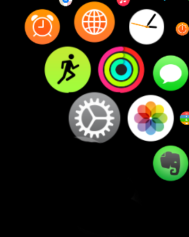
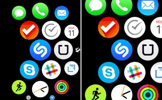
1. Bring up your apps on the home screen by pressing the Digital Crown.

Apple-Watch-Camera-1

2. Tap the Camera app icon to start the camera.

3. The Camera app should also conveniently launch on your iPhone if it has not already been started.

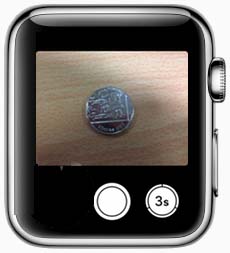
4. A live preview of what your iPhone camera is seeing will appear on your Apple Watch! Time to frame the perfect shot with your iPhone camera.

5. Tap the center button on the Apple Watch view to take a photo of the current scene or hit the 3-second timer button to take a photo on a delay. This is great for giving everyone a chance to strike the perfect pose.

Apple-Watch-Camera-2

6. The photo is automatically saved to the iPhone camera roll which is also viewable on the Apple Watch.


Pretty cool right? Luckily all of this comes working right out of the box and you don’t need to install anything additional to begin taking photos remotely with your Apple Watch. Finally taking remote or timed photos has moved into the 21st century. Prop that iPhone next to your pet’s favorite sleeping spot and wait for the perfect shot to present itself. Then just snap away remotely using your Apple Watch. It’s an amazing time to be alive!


Apple iMessage vs Google Hangouts

Are you a frequent message sender? Do you use an app for sending messages through your smartphone? Yeah, I thought so. Chances are you’re acquainted with either Apple’s iMessage service or Google’s Hangouts messaging app or even (gasp!) both of them. Basically they are both capable of conveniently sending short text messages to friends and colleagues. There are some important differences however which could make you lean towards using one or the other.

messages_hero

Apple’s iMessage like most things Apple, only plays nice with fellow Apple devices and services and is not accessible on a PC. You’ll need an Apple device and account to use iMessage to send messages between your Mac, iPhone, iPad, etc. to other Apple users. Of course you can also launch video and voice chat through iMessage though you are really launching separate apps (FaceTime) for these features and they are not technically part of iMessage. For sending quick texts and not having to fully rely on SMS messaging, iMessage is a champion. Conveniently, iMessage can also default to SMS if local internet is not available.

n7-n4

Google’s Hangouts is steadily gaining in popularity for ease of use and availability on many platforms. Like Apple, you will need an account to use Hangouts, in this case a Gmail or Google+ account. Unlike Apple’s iMessage however, Hangouts can be used from any capable browser on a PC, any Android device, and even any iOS device simply by using your Google login. Also unlike iMessage, you can make video and voice calls directly from the app itself with full support for group chats. This is probably the biggest advantage Hangouts has over iMessage in that you don’t need to launch separate apps if the mood strikes to make a quick call or even group video chat with friends. The major drawback is that Hangouts does not support SMS so if your message doesn’t go through you’ll have to wait until you get a data connection back.

Either way, for quick text communications you really can’t go wrong with either service depending on the devices you use.

Go Grayscale on the Apple Watch Battery

The Apple Watch is just full of surprises. Though it has a beautiful Retina display, there is an option to remove all color by enabling grayscale mode. This is meant for users who have problems with color perception who benefit from fewer colors being displayed. Nobody said that you can’t use it to force a retro aesthetic on the Apple Watch though. As a nice little benefit, battery life could also be slightly increased with the screen not having to show the full range of colors. In order to set the Apple Watch to grayscale mode, simply follow these steps.

1. Start the Apple Watch app from your iPhone.

2. Tap the General option.

IMG_0444

3. Tap the Accessibility option.

IMG_0445

4. Tap the Grayscale toggle switch to on to enable grayscale mode.

Now the display should be full grayscale with absolutely no color. All apps and menus will also be displayed in grayscale so you won’t need to enable or disable it for individual apps. To reverse the process simply return to the grayscale toggle switch and switch it to off to enable full color display. Also note that this cannot be done directly from the Apple Watch, you’ll need to use your iPhone to switch between grayscale and color mode.

IMG_0446

If you do intend to use this feature just for looks, it is recommended that you tell your friends you found the watch in an old trunk in the attic and that it belonged to your time traveling grandfather. Extra points for diligence if you slap on a custom watch face to support that story.

How to mute audio for individual Chrome tabs

Last year when Google Chrome rolled out for the latest updates, it comes up with feature  of Sound Icon for individual Tabs. Perhaps it proved handy for Chrome users to get noticed which tab is occupied with Music stuff. Here is one more interesting and convenient tips for music listeners. Just open your Google Chrome browser and type in address bar

chrome: //flags/” and Press “Ctrl+F” and search for “Enable tab audio muting UI control”,

Press: Enable it

chrome_muting

When it successfully enabled, Test some Music:

chrome-mute

Mute Tab feature just added for experimental test purposes, but maybe this feature will integrated with upcoming updates of Chrome.

Increase the Size of Home Screen App Icons on Apple Watch

With the limited screen size on the Apple Watch, it can be a chore to launch apps and hunt down those pesky little icons with a tap. It can be bad enough tapping accurately if you have larger hands on a smartphone let alone wrangling a watch sitting on your wrist with a smaller screen. Luckily there is a very simple trick that can make the icons noticeably larger and easier to tap. Follow these steps to make those home screen icons more manageable.

s1

1. Tap the Settings app on your Apple Watch. It’s the grey and white gear icon.

s2

2. Tap General, again with a grey and white gear icon.

s3

3. Tap Accessibility.

s4

4. Tap Reduce Motion to toggle it to the off option.

Now, instead of the icons changing size dynamically as you move through the apps on the home screen, they will all appear slightly larger and the same size. You do sacrifice some of the slick interface of the icons changing size as they move but you gain usability. The icons being larger makes them much easier to tap overall. Of course if you find you can’t live without the pretty icon motion, you can simply go back to the Reduce Motion option and toggle it back on.

This process can also be done through the paired iPhone if you want to change the settings on a larger screen. If you really find tapping annoying, you can also launch an app by moving it to the center of the home screen and then zooming in with the digital crown. The app will launch immediately without having to tap it, you need only first move it to the center of the screen.

apple-watch-reduce-motion

Hopefully with these tips, launching and managing apps on the home screen should be that much faster.

WhatsApp 2.12.87 Material Design Interface Updates Galore

Popular messaging app WhatsApp just received its latest update in the form of version 2.12.87. The update brings fairly significant changes to the app interface and cleans up some residual and dated interface elements of earlier versions. Most importantly, it is meant as a major update to closely conform with Google’s Material Design interface philosophy. The update is more about cleaning up the look of WhatsApp as opposed to the nuts and bolts beneath.

WhatsApp-Call

The most noticeable and perhaps significant change is in the layout and interface of a WhatsApp call. The old interface looks a lot like the standard Android phone call with a somewhat glaring red disconnect button on the bottom, a green WhatsApp call indicator, and a black and white background. This has seen a major overhaul with the black being replaced by a more pleasant teal background color, complete removal of the green call indicator, larger caller name font, a more muted red for the disconnect button, and some toned down options icons. It is a significant and welcomed change from the old interface.

WhatsApp-Messaging

The messaging interface has also seen some small but notable changes. The background has been muted as with some of the elements on the call screen. You can of course change the background but the default one has been subtly altered. Some old menu icons have been removed entirely and are now text only. Searching through your contacts is also somewhat cleaner.

WhatsApp-Cleaner-Search

You simply tap the search area and begin typing to locate a particular contact. Some minor interface elements have been removed in the search area which also serve to clean up the overall look.

One final change that is helpful to those with friends on iOS devices is the ability to receive the newly released iOS emojis with varying skins instead of the default ones. It’s not possible to send them from Android but if an iOS friend sends a new emoji, they will be displayed properly in WhatsApp.

WhatsApp continues to refine the look of their app and these design changes are definitely in the right direction. It’s a much more pleasant messaging experience all around.

Source: WhatsApp on Google Play Store