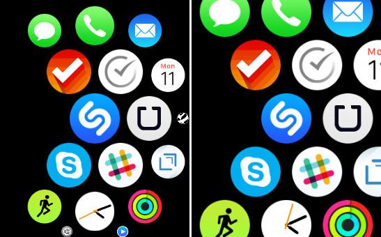
With the limited screen size on the Apple Watch, it can be a chore to launch apps and hunt down those pesky little icons with a tap. It can be bad enough tapping accurately if you have larger hands on a smartphone let alone wrangling a watch sitting on your wrist with a smaller screen. Luckily there is a very simple trick that can make the icons noticeably larger and easier to tap. Follow these steps to make those home screen icons more manageable.
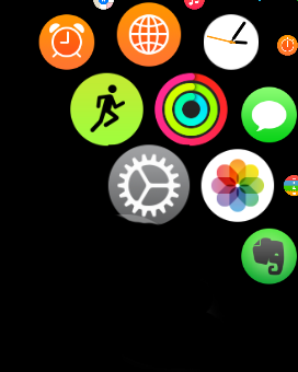
1. Tap the Settings app on your Apple Watch. It’s the grey and white gear icon.
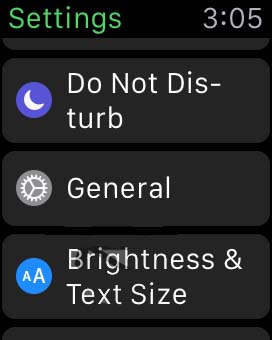
2. Tap General, again with a grey and white gear icon.
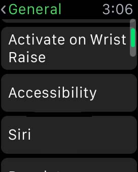
3. Tap Accessibility.
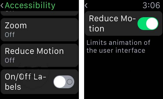
4. Tap Reduce Motion to toggle it to the off option.
Now, instead of the icons changing size dynamically as you move through the apps on the home screen, they will all appear slightly larger and the same size. You do sacrifice some of the slick interface of the icons changing size as they move but you gain usability. The icons being larger makes them much easier to tap overall. Of course if you find you can’t live without the pretty icon motion, you can simply go back to the Reduce Motion option and toggle it back on.
This process can also be done through the paired iPhone if you want to change the settings on a larger screen. If you really find tapping annoying, you can also launch an app by moving it to the center of the home screen and then zooming in with the digital crown. The app will launch immediately without having to tap it, you need only first move it to the center of the screen.
Hopefully with these tips, launching and managing apps on the home screen should be that much faster.

